Bridging Generations: Transforming an Early 2000s NGO Website for Today's Users
This project focuses on redesigning the website for an NGO that supports people at risk of social exclusion. The goal was to modernize the site, improve usability, and make it more accessible to users who are often unfamiliar with digital tools.
Problem Statement
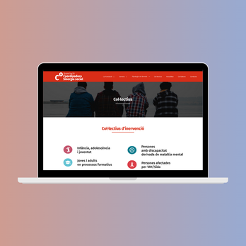
The NGO’s existing website was outdated, hard to navigate, and not responsive. Users, many of whom have limited digital experience, struggled to find the information they needed.
Goals
-
Modernize the website’s design and structure.
-
Ensure it is accessible and easy to navigate for all users, regardless of their digital skills.
Before & After


Design Thinking Methodology
Research & Insights
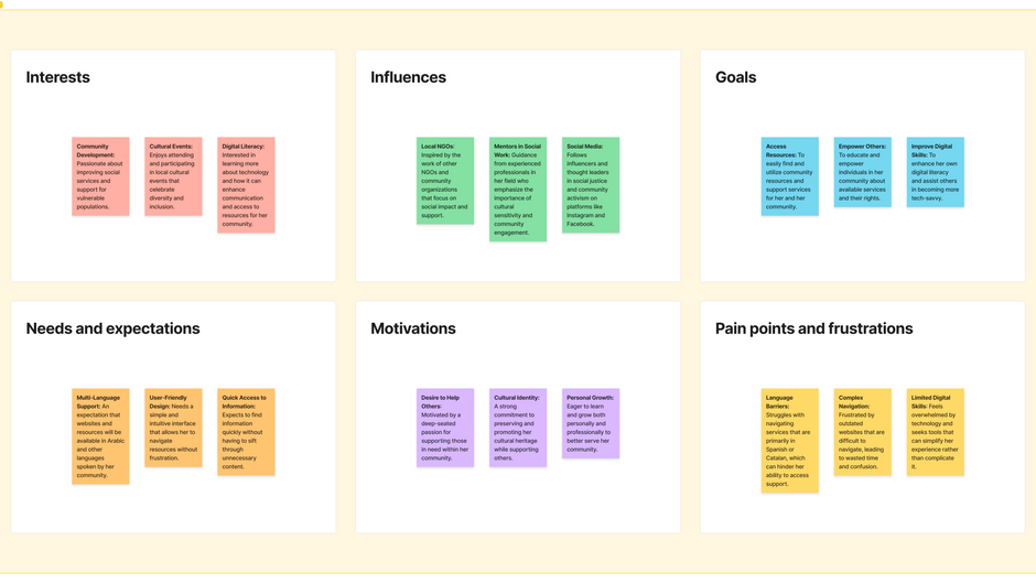
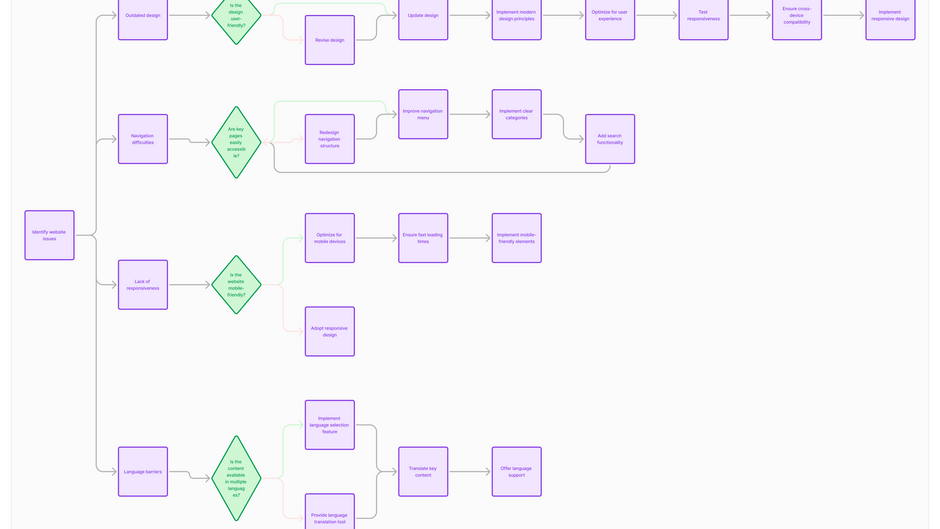
User interviews and usability testing revealed that the website’s complex navigation and lack of responsiveness were the primary frustrations. Many users could not access key resources or understand how to interact with the site, especially those accessing it via mobile devices. This research informed key design decisions aimed at reducing complexity.

Solution Designs
The redesign introduces a clean, intuitive layout with clear paths for accessing information.
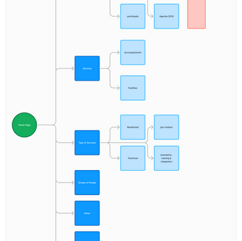
Mobile optimization ensures users can navigate smoothly, whether on a phone or a desktop. Visual hierarchy and icons further guide users through the site, helping those unfamiliar with digital interfaces.
Wireframes


Impact

Challenges & Solutions
-
Had to use the Drupal framework, which constrained design flexibility and increased complexity.
-
No mobile wireframes were built or considered, as the Drupal framework handles responsiveness by itself.
-
Some tabs could not be eliminated due to NGO regulations on required website content.
-
Worked independently on the project without support from developers.
-
Limited the scope to design work only, preventing the website from being launched or developed.
-
Focused on user needs without fully considering the technical constraints of development.


Future Improvements
-
Establish a Design System: Develop a design system to ensure consistency in future updates.
-
Improve Navigation Structure: Simplify the navigation by reducing the number of submenus and organizing content into clear categories.
-
Change Framework: Consider changing the framework to allow for more flexibility in design and improved mobile optimization.
-
Collaborate with Developers: Work closely with developers to ensure effective implementation of the design.
-
Conduct User Testing: Perform additional user testing to gather insights for design refinement.
-
Design for Devices: Create wireframes optimized for mobile and tablet interfaces.
-
Integrate Interactions: Add interactive elements to enhance user engagement.

Lessons Learned
-
Value of Collaboration: Independent work underscored the importance of collaborating with developers for a feasible product.
-
User-Centric Design: Balancing user needs with technical constraints leads to more effective designs.
-
Tool Flexibility: The choice of framework affects design flexibility; awareness of limitations is crucial.
-
Mobile Design Considerations: Considering mobile design early enhances user experience, even with responsive frameworks.

Conclusion
This project reinforced the significance of user-centered design, particularly for NGOs where accessibility and clarity are vital. This redesign establishes a strong foundation for a more user-friendly and modern website for Sinergia, addressing the real-world challenges and needs I encountered while working with the organization.

