Building Consistency: A Design System for NLP-Driven CX Support
This project centers on creating a design system that acts as a powerful tool for boosting visual consistency and enhancing the user experience. Its goal is to make collaboration smoother among teams while offering a unified framework that brings design and development efforts together.º

Problem Statement
-
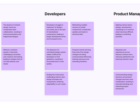
Inconsistent Visual Language: Variations in design elements created a fragmented user experience, reducing overall coherence.
-
Barriers to Team Collaboration: Disconnected design and development efforts led to frequent misalignment and delays.
-
Limited Reusability: Without standardized components, teams repeatedly recreated similar elements, slowing down workflows.
-
Challenges in Scaling: Adding new features was time-intensive due to the lack of a unified design framework.

Goals
01.
Establish a Cohesive Brand Identity
02.
Enforce Design Consistency
03.
Enable Scalability
04.
Streamline Collaboration
05.
Prioritize Accessibility
Starting Point
The development of the design system did not begin from scratch; instead, we started with an existing design system that was already in use. Our primary focus was on enhancing and refining this foundation rather than overhauling it entirely.
This involved identifying and creating missing components and states, as well as addressing areas that users found confusing or difficult to navigate.
While we aimed to modernize and improve the overall system, we recognized that we could not make sweeping changes to the styles or components, as the product had already been implemented with many established elements.

Methdology
Research & Insights
In the research phase, we focused on gathering in-depth insights through user interviews and analyzing recordings from LogRocket, a tool that allowed us to observe real user interactions.
The interviews provided valuable qualitative data, revealing specific challenges and frustrations whereas LogRocket's recordings offered a direct view of how users interacted with the product, highlighting areas where they struggled or encountered issues.


Research Findings
Menu
There were noticeable inconsistencies in menu interactions, particularly with background colors and arrow indicators, leading to confusion for users.
Configurations
Some menus were not configured correctly, resulting in an inconsistent user experience across the platform.
Responsiveness
When resizing the browser window, certain components did not scale appropriately, causing them to be cut off or disappear entirely.
Banners & Disclaimers
Multiple versions of banners and disclaimer components existed, with inconsistencies in colors and typography.
Hover effects
During hover interactions, some buttons displayed incorrect colors, causing the text to blend into the button background, making it difficult for users to read.
Components Overview
Branding elements
-
Logo variations and usage guidelines.
-
Imagery styles that align with the brand's identity.
-
Iconography that complements the overall design language
Color Palette
-
Primary and secondary colors with HEX and RGB codes.
-
Guidance on using colors for backgrounds, text, and UI elements.
-
Contrast ratios to ensure readability and accessibility.
Typography
-
Selected font families, sizes, and weights.
-
Usage examples for headings, body text, and call-to-action elements.
-
Hierarchical structures to maintain readability and visual flow.
UI Components
-
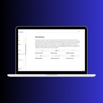
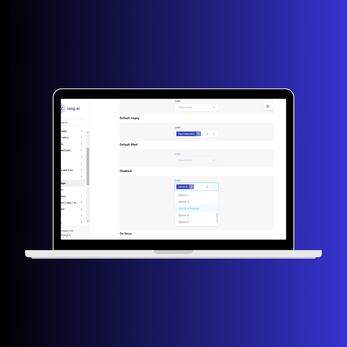
Buttons, forms, modals, and cards with usage guidelines.
-
Examples showcasing different states (hover, active, disabled).
-
Best practices for integrating components into designs.
Accessibility Guidelines
-
Color contrast requirements for text and background.
-
Guidelines for screen reader compatibility.
-
Considerations for keyboard navigation and interaction.
Documentation and Resources
Links to other documentation, style guides, and additional resources are provided to assist teams in implementing the design system effectively.
Layout and Grid Systems
-
Grid systems and spacing rules to create balanced and organized designs.
-
Responsive design principles for adapting layouts to various screen sizes.
-
Margins and padding specifications for UI elements.
Implementation Examples
This section showcases real-world examples of how the design system has been applied in various projects, highlighting its impact on user experience and visual consistency.
SNEAK PEEK


Design principles

Challenges & Solutions
A key challenge was prioritizing the design system within our startup, where one designer and two front-end developers were managing multiple projects.
To address this, we encouraged collaboration between design and development, integrating design system work into our existing workflows.
This approach allowed us to treat the design system as an ongoing project, dedicating time whenever we had spare capacity and ensuring we maintained the quality of our other initiatives.


Future Improvements
-
Complete Documentation: Some sections of the design system are still under-documented. Prioritizing full documentation of components will improve consistency and ease of use for all teams.
-
Responsive Design Enhancements: Further improvements are needed to address issues with component responsiveness across different devices.
-
Regular Updates: Maintaining regular feedback loops and updates will help keep the system adaptable to evolving user needs and industry standards.

Impact

Lessons Learned
-
Collaboration is Key: Regular communication between design and development teams was essential to ensure the design system aligned with design goals and technical requirements.
-
Iterate Continuously: The design system should be treated as a living project, requiring constant feedback, iteration, and updates to remain relevant and scalable.
-
Document Everything: documentation helps maintain consistency, especially as teams grow or shift,

Conclusion
The successful implementation of the design system significantly improved visual consistency and user experience across the platform. It also enhanced collaboration among teams, enabling them to work more efficiently and effectively.
Moving forward, the design system will serve as a solid foundation for future projects, ensuring scalability and alignment with modern design principles.


